Major Project 1 - Task 01 - Proposal Development
04/01/2025-26/03/2025
Amelia Intan Cahyani/ 0355211
Major Project 01/ Bachelor of Design (Hons) in Creative Media
Task 01 - Proposal Development
Instruction
Task 01 - Proposal Development:
Week 01:
Once our group was formed, we conducted a brainstorming session where each of us presented an idea, explaining its purpose and potential impact.
-
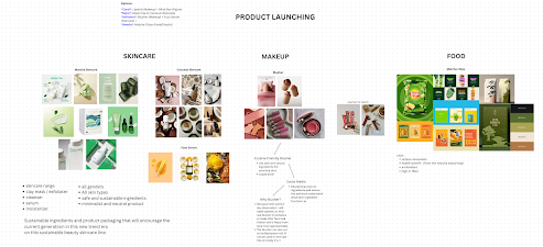
Adrianna’s Idea: A makeup product, specifically an Eczema-Friendly Blusher. Since blusher is an essential cosmetic item for many women, her idea focuses on creating a formula made from natural ingredients that would be safe for sensitive skin.
-
Amirah’s Idea: A sustainable and minimalist matcha skincare brand that is gender-inclusive. This concept emphasizes the use of eco-friendly ingredients and packaging, aligning with the growing trend of sustainability in the beauty industry.
-
Amelia’s Idea: A matcha-flavored chips brand, offering a unique and innovative snack with health benefits. The idea focuses on creating a fiber-rich, nutritious alternative to conventional chips.
-
Carol's: A blind box inspired by POP Mart, designed to appeal to the younger generation. The concept includes a fun and interactive element where the blind box features dry clay figures, adding a creative and collectible aspect to the experience.

Week 02:
After finalizing our initial ideas, we shared them with Ms. Vityaa and discussed our thought processes with her. She advised us to move forward with the blind box concept, as it offered more opportunities for creativity and allowed us to showcase our design skills in a unique and engaging way.
Following her guidance, our group had a discussion and unanimously agreed to proceed with the blind box idea. We then began brainstorming potential figure designs that would fit within this concept.
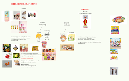
Since we planned to use dry clay for the figures, we researched different references to ensure they would be feasible to create. We explored two main concepts:
-
Cute & Simple Figures – Our first idea was to design adorable, minimalistic figures such as Maltese dogs or other small animal characters. This approach focused on creating visually appealing collectibles with a charming and approachable aesthetic.
-
Instant Noodle Collaboration – Our second idea involved collaborating with an instant noodle brand like Samyang, where each blind box would represent a different noodle flavor. This concept aligned with the rising trend of blind boxes in Asia and could add value to the brand by merging food culture with collectible figures.

Following our decision to proceed with the blind box concept, we were assigned to create a proposal slide to present in class during Week 3.
Building on Miss Vityaa’s feedback, my group and I divided tasks among ourselves, assigning specific slides and research responsibilities. We focused primarily on analyzing the current market and competitors, which helped us gain a clearer understanding of how well the Mamee brand is performing and where our blind box concept could fit within the industry.
This research process allowed me to refine and strengthen my idea, ensuring that it aligned with market trends and consumer interests. Collaborating with my teammates, we worked to develop a well-structured proposal that highlighted the potential, uniqueness, and viability of our blind box project.
submission
This week, our group presented the Mamee Blind Box proposal in class. Unfortunately, I was unable to participate due to a family matter. However, we received valuable feedback from our lecturer and classmates, which helped us identify areas for improvement.
One major concern was the board game concept many questioned how we would address the issue of consumers repeatedly purchasing blind boxes without being able to collect all the necessary board game pieces. This highlighted a potential flaw in our approach, prompting us to brainstorm solutions to make the experience more rewarding for buyers.
To refine our project further, we also revisited our research objectives to establish a more solid project goal. As part of this process, we designed a survey to gather deeper insights into our target audience's preferences and behaviors. This research would help us refine our concept and ensure our blind box aligns with consumer expectations.
Week 04:
This week, my group consulted Miss Vityaa, who gave us the option to either improvise and refine the board game concept or explore a new direction. After discussing the feedback we had received, we collectively decided to drop the board game idea and instead create a new brand and product inspired by the Mamee mascot.
Our goal remained the same to evoke childhood snack nostalgia while making the blind box experience fun, collectible, and meaningful. With this new approach, we aimed to design a playful, collectible series featuring a Monster Baby version of the iconic Mamee Monster.
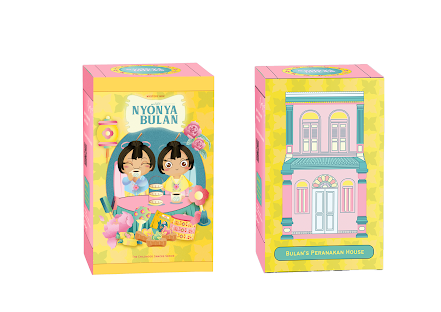
The concept retains the cup noodle-inspired packaging but introduces fresh elements such as interactive accessories and themed environments like a house, kitchen, and garden, allowing buyers to personalize their collectible experience. Each blind box includes unique accessories that enhance the figurine’s world.
To support this shift, we delegated tasks for the second part of our proposal:
Tasks to be Completed by Week 5
- Mini Monster Name – Everyone will suggest potential names.
- Sub-Branding – Amirah & Adrianna will develop a sublogo, typography, and color scheme aligned with Mamee’s playful identity.
- Character Design – The team will sketch six mini monster designs.
- Themed Environments – Amirah will design settings like a house, kitchen, and garden.
- Posters – Amelia & Adrianna will create three promotional posters.
- Photo Cards – Carol & Adrianna will design six collectible photo cards.
- Banner Design – Amelia will create a banner for marketing.
- Snack Packaging – Amirah will design six snack variations for the brand.
- Guide Pamphlet – Carol will develop a pamphlet explaining the blind box concept and collectibles.
Additionally, we revised our problem statement to highlight the need for innovative product engagement and cultural storytelling, ensuring that our concept aligns with Mamee’s identity while offering a fresh, collectible experience.
Week 05:
After multiple discussions and consultations with our lecturer, we decided to develop our own character figure as a sub-brand under Mamee while maintaining its identity. Our new project goal focuses on childhood snack nostalgia, specifically targeting Gen X and Gen Z, reminding them of Malaysia’s beloved childhood treats.
To replace the original board game concept, we introduced an interactive packaging playset. This new concept allows consumers to place the character figure within a themed playset, similar to a Polly Pocket-style design. The packaging is designed to be engaging and reusable, enhancing the overall experience and encouraging consumer interaction beyond just collecting figures.
Amirah sketched out the interactive packaging design, ensuring it adds value to the product by making it both playful and functional. This approach strengthens engagement, aligns with the nostalgic theme, and gives consumers a reason to keep and display the packaging rather than discarding it.
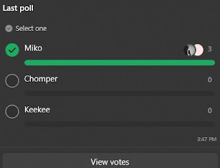
Alongside refining the packaging concept, we focused on brainstorming a character name and developing its personality, identity, and background to create a more engaging and relatable brand.
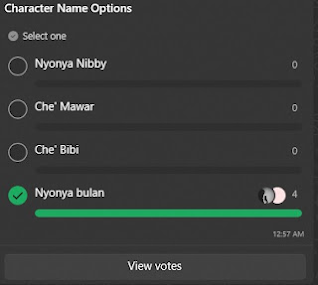
To ensure a collaborative decision, we conducted a poll with various name suggestions. After gathering votes, everyone agreed on the name "Miko". This name was chosen to reflect the playful and nostalgic essence of the character while staying true to the Malaysian childhood snack theme.
Moving forward, we will continue refining Miko’s personality and backstory, ensuring that it resonates with our target audience and strengthens the brand identity.


After another consultation with our lecturer, we received feedback encouraging us to give our character a more local identity and refine the name to better reflect Malaysian culture. This led us to further develop the character’s art style, name, and color palette, drawing inspiration from Malaysia’s rich cultural elements.
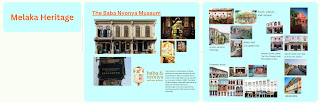
Since Adrianna initially took inspiration from Mamee’s birthplace, Malacca, we explored local environments, traditions, and cultural aesthetics to enhance the authenticity of our design. Miss Anis also suggested incorporating more distinct Malaysian influences to strengthen the character’s connection to its heritage.
With this feedback in mind, we refined the concept, visual style, and branding to ensure our character truly represents Malaysia’s nostalgic and cultural essence, making it more relatable and meaningful to our target audience.
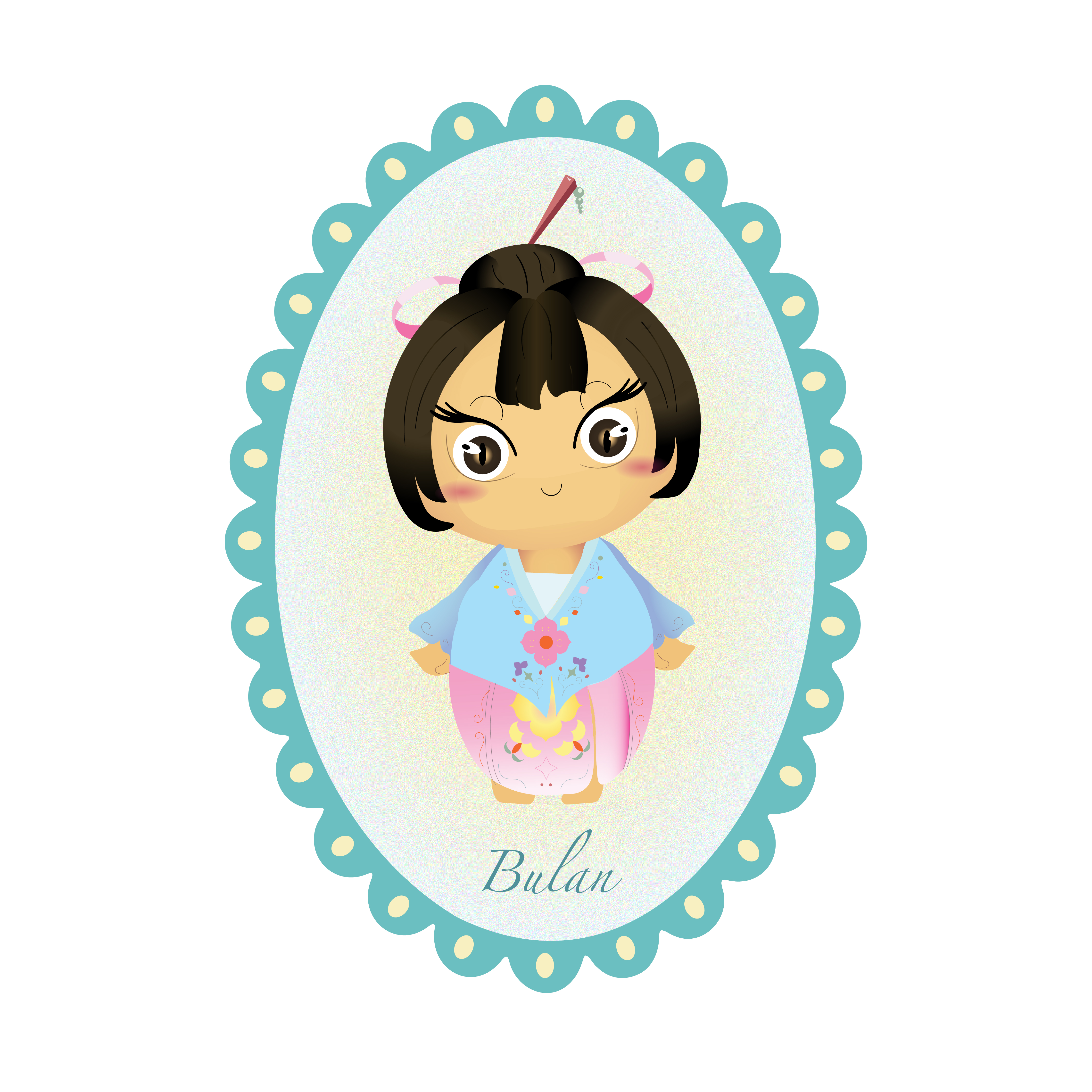
After further discussion, we decided to revise the character’s name, drawing inspiration from Melaka’s iconic street names, Peranakan kuih, and traditional Malaysian snacks. This change helps strengthen the connection between our character and Malaysia’s rich heritage, making it more meaningful and culturally relevant.
To ensure authenticity, we also researched figurine designs and Nyonya heritage elements, using them as references to refine the character’s appearance, attire, and overall aesthetic. This deeper exploration of cultural influences allows us to create a unique and nostalgic collectible that resonates with both local and international audiences.


The branding draws inspiration from Peranakan heritage, combining elements such as kebaya, batik motifs, ceramic patterns, and traditional aesthetics. By blending these cultural influences, we aim to create a visually rich and nostalgic identity that reflects Malaysia’s heritage while maintaining a modern, collectible appeal.
This week’s focus was on establishing a cohesive brand direction, ensuring that the character’s design, color choices, and patterns stay true to the authentic essence of Peranakan culture while appealing to both local and international audiences.


Our packaging design goes beyond aesthetics, focusing on visual appeal and functional interactivity to enhance the overall user experience. Instead of being just a conventional box, the packaging itself becomes an integral part of the storytelling and engagement process.
The design maximizes every surface and space, encouraging consumers to interact with it rather than simply discarding it. By carefully crafting both the exterior and interior graphics, we aim to surprise users with intricate cultural details that enrich the narrative and highlight Peranakan heritage.
To create a welcoming and immersive unboxing experience, we integrated guided text and instructions:
- First Flap – A warm greeting message sets the tone for the experience.
- First Divider – Features Peranakan patterns, reinforcing cultural identity.
- Second Divider – Reveals the character, playset, snack, and accessories, transforming unboxing into a multi-layered journey.
This interactive approach ensures that every element of the packaging contributes to a playful and memorable experience, making it not just a collectible but an immersive cultural exploration that blends storytelling, design, and tradition.
First design with an improved front cover:


- Packaging:

- Paper Bag:

- T-Shirt:


- Banner Stand:

- Social Media (Instagram):


- Posters:


- Photocards:


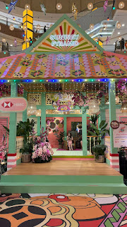
- Exhibition:

- Final Presentation Slides:
Feedback:
Week 01:
- Explored current market trends to ensure the idea had a strong research foundation.
- Discussed and brainstormed potential product ideas with the team.
Week 02:
- Presented four ideas and determined that three were too simple.
- Carol’s blind box idea was chosen as the final concept.
- Conducted further research on blind boxes to establish a solid structure.
- Revamping the Mamee mascot was approved.
- Assigned tasks to gather relevant information.
Week 03:
- The board game concept was introduced for uniqueness but lacked structure.
- Presentation was thorough but the direction was still unclear.
- Needed to determine what would attract consumers to a Mamee figure.
- Addressed concerns about duplicate figures in blind box purchases.
- Clearly outlined box contents and survey structuring.
- Started working on character development to align with Mamee’s branding.
Week 04:
- Pivoted from revamping Mamee’s mascot to creating a new character series under a Mamee blind box product line.
- This new approach provided more creative flexibility and aligned better with graphic design objectives.
- New problem statement and project objectives were developed.
Week 05:
- Expanded the target audience beyond Gen Z to include tourists who may want a Malaysian souvenir.
- "Miko" was rejected as it sounded more Japanese than Malaysian.
- Character background and personality were strong, but the design needed improvement.
- Initial branding and mood board review showed that the logo resembled a food product rather than a blind box brand.
- Studied existing brands to identify unique selling points.
- Conducted further research on Melaka’s cultural art history and local branding strategies.
- Removed the gameplay element due to complexity and replaced it with a playset concept.
- Branding was redone to better fit the new concept.
- Tasks for next week: Character designs, snack designs, branding, photocards, and packaging.
Week 06:
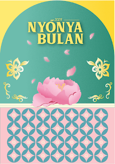
- Finalized "Nyonya Bulan" as the brand name.
- Completely removed Mamee references to establish an independent brand.
- Created a new parent brand for future series expansions.
- Ensured consistency in design style and color schemes.
- Enhanced the Peranakan-inspired elements in the playset background.
- Refined posters to be more attractive.
- Updated designs and completed deliverables.
Week 07:
- The parent brand name "Cerita Kita" needed to be changed due to similarity with another project.
- The presentation flow was clear, but the parent brand still lacked a strong identity.
- The character design was well-developed and detailed.
- The playset’s interchangeable background mechanism needed improvement for better color harmony.
- The poster design was visually strong with a well-chosen color palette.
- The logo design process was well-explained in the presentation.
Reflections:
Experience:
Working on this project was both challenging and stimulating, pushing me to adapt, collaborate, and refine ideas along the way. The excitement of developing a product inspired by Malaysia's heritage made the process deeply meaningful. However, the many changes and revisions throughout the project, along with the demands of teamwork, often brought moments of stress.
Despite the challenges, the final outcome exceeded our expectations, making the effort worthwhile. This project was a valuable learning experience in product development, branding, and cultural storytelling. More importantly, it reinforced the importance of communication, empathy, and teamwork, all of which played a crucial role in bringing our vision to life.
Observation:
We initially explored the idea of blind boxes, recognizing their popularity in the market. Our first concept focused on a Mamee mascot-inspired figure, but through extensive research and refinement, we pivoted towards creating an independent brand inspired by Melaka’s Nyonya Peranakan heritage.
This shift highlighted the importance of refining ideas, conducting thorough research, and ensuring that a product is both meaningful and marketable. The process taught us that great design isn’t just about aesthetics, it’s about crafting a story, evoking emotions, and creating something that truly connects with the audience.
Findings:
Through the challenges, revisions, and refinements, I gained a deeper understanding of:
- How design shapes consumer experience beyond just visuals.
- The importance of storytelling in branding, especially when representing culture.
- The role of adaptability and flexibility in product ideation.
- Effective team collaboration and communication in a professional setting.
- The power of research and feedback in refining and improving a concept.


Comments
Post a Comment