03/04/2023 - 07/05/2023 / Week 1 - Week 5
Amelia Intan Cahyani/ 0355211
Typography/ Bachelor of Design (Hons) in Creative Media
Task 1 - Exercises
TYPOGRAPHY TASK 1 - EXERCISES
AMELIA INTAN CAHYANI 0355211 - Bachelor of Design in creative media
Lectures - Week 1
In a recorded lecture during our first lesson, the history and development
of typography were introduced. We were asked to sketch our ideas for type
expressions based on four words throughout class.
Introduction
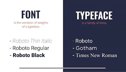
Font describes a typeface's individual fonts or weights.
For instance; Georgia Bold, Georgia Italic, etc.
Typeface refers to the
different families of fonts that do not have any shared features.
A few examples include; Georgia, Arial, Helvetica, Times New Roman,
Didot, Comic Sans,
and Futura.
fig 1 Examples of both Fonts and Typeface
Development / Timeline
1. Early letterform development - Phoenician to Roman
- Performed out by carving into stone or wet clay
- The letterform can be impacted by tools.
fig 2 Evolution of Phoenician Letterform
Writing directions:
- Phoenician: Right to left
- Greeks: 'Boustrophedon' Read alternately from left to right and
left to right and the same goes for the orientation of the
letterforms,
Both Phoenician and Greeks did not use letter space or
punctuation.
As a result, the letterform's orientation was modified.
fig 3 Boustrophedon
Direction of Letterform
Letters were painted onto the marble by Etruscan and Roman carvers
before being carved into it. The carved letterforms reflected the
variation in weight of their strokes from vertical to horizontal.
fig 4 Phoenician to Roman
Within 1000 BCE, the Phoenician letter A evolved over a period of
time.
Greek letter A borrows from Phoenician but flips it, and then flips it
once again by 90 degrees to produce the letter A that we are familiar with
today.
In terms of the brush being employed, the Roman letter A is the more
polished version.
2. Handscript from 3rd to 10th century
- Roman monuments were found to have square capitals. Serifs were added to the primary stroke in them. These were made by
angling the tip of a pen off-perpendicular by 60 degrees.
- Square capitals were condensed into rustic capitals. Compared to square caps, they were quicker to write but more
difficult to read. These were made by angling the pen off-perpendicular
by 30 degrees.
- Transactions were conducted in cursive hand. For speed, they were condensed, creating some letterforms in
lowercase.
- Uncials adopted several features of Roman cursive
writing. Uncials is Latin for twelve. Compared to rustic capitals, they
were easier to read.
- As a result of the formalisation of the cursive hand,
half uncials signal the start of the lower case
letterform.
- Charlemagne made a decree to harmonise all religious
writing. The Abbot of Saint. Martin Tours was given charge of this. The
texts were rewritten by the monk in capital letters, tiny letters,
punctuation, and capitalization, setting the bar for calligraphy in that
century. The Caloline Miniscule is one illustration of this.
fig 5 Hand Script from the 3rd to 10th CE
In Northern Europe, a condensed and sharply vertical letterform known
as Blackletter or Textura emerged after Charlemagne's empire fell
apart. A more rounded, openhanded letterform known as Rotunda was
utilised in the South.
3. Text Type Development
1450 Blackletter - 1475 Oldstyle - 1500 Italics - 1550 Script - 1750
Transitional - 1775 Modern - 1825 Square Serif/ Slab Serif - 1900 Sans
Serif - 1990 Serif/ Sans Serif
fig 6 Text Type classification
Lectures - Week 2
1. Text Type Development
Tracking: Kerning and Letterspacing
- Kerning is the term for the automatic adjusting
of letter spacing. used primarily in headlines. Letters end up
encroaching on one another's spaces.
- Letterspacing refers to the practise of spacing
out letters.
fig 7 Kerning and Letterspacing
- The act of adding and removing spaces from a word or sentence
is known as tracking. Normal tracking, loose tracking, and tight tracking are
different types. The legibility of the text decreases with
looser tracking.
fig 8 Different types of Tracking
- As they can stand on their own, uppercase letters are always
spaced, whereas lowercase characters need
counterform to preserve readability. The
counterform is ruined by adding spaces to lowercase
letters.
fig 9 Counterform
2. Formatting Text
Grey Value (n) The whole text value on a white page.
- The end of the line is highlighted by
flushing to the right. useful in circumstances (like captions or axil) where the
relationship between text and image is unclear in the absence of a
strong rightward orientation. shaming the left.
- Flush left hence how writing by hand is uneven. Each
line begins at the same location, but it finishes where the line
terminates. brings about an even grey value. On the right, teasing
occurs.
- By forcing symmetry on the text, a
centered format gives both ends of the lines identical
importance and weight. adds a pictorial quality to content that isn't
naturally graphical. line breaks should be changed to reduce ragging
because the right and left ragging produces a strong form.
- A symmetrical form is established on the text by
justified. It causes "rivers" of white space to run through the text since it
leaves less room between words and characters. To correct this issue, care
must be taken with hyphenation and line breaks.
fig 10 Text Formatting
3. Texture
Avoid using type that draws attention to itself before the reader can
read the text themselves. Change the type if the words appear before the
type.
In comparison to type with a relatively smaller x-height or lighter
stroke, type with a generous x-height or relatively heavy stroke forms a
darker mass on the page.
If the x-height is greater than the ascender and descender, it is easier
to read.
fig 11 Anatomy of a Typeface
4. Leading and Line Length
Type size: Text should be large enough to read comfortably at arm's
length.
Leading: The white space in a typeface between neighbouring lines.
Too-tightly spaced text increases vertical eye movement, making it
simple for readers to become disoriented. Striped patterns are created
by type that is set too loosely and are distracting.
Line length: Longer lines need more leading, whereas shorter lines need
less. Choose a line length of 55 to 65 characters. Reading is hampered
by extremely lengthy or short line lengths.
5. Type Specimen Book
Displays typeface samples in a range of sizes. used to give precise
references for things like type, type size, type leading, and type line
length.
A space of text should be created that can fill a page or a screen. The
ideal text is middle grey in tone, not striped.
To clearly see the link between ascenders on one line and descenders on
the line below it, it can be helpful to magnify type on the screen by
400%.
fig 12 Type Specimen Book Sample
Lectures - Week 3
1. Indicating Paragraph
- Indicating a paragraph break with a "pilcrow" ( ¶ ). Although it is not frequently used today, this technique was used in
old manuscripts.
- You can divide up paragraphs with the "line space" (leading)
between.
- Make sure the line spacing/paragraph break is the same size as your
leading (for example, if your leading is 12 pt, your line spacing
should be 12 pt).
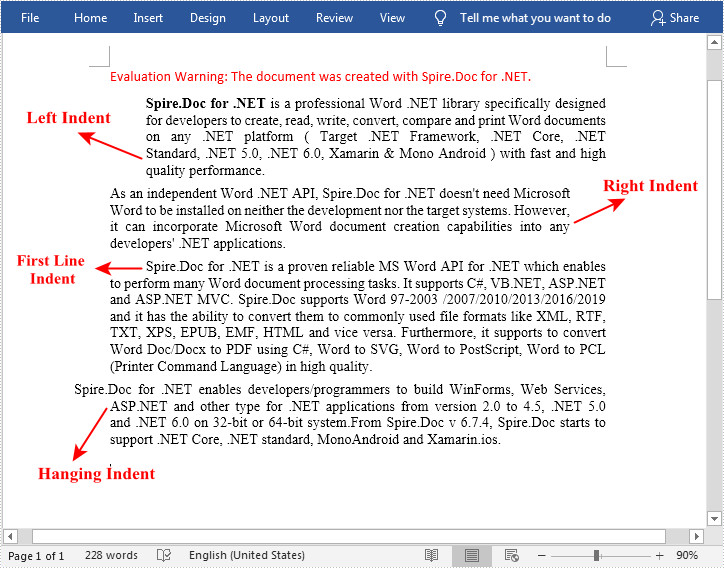
- The beginning of a paragraph can also be indicated by indentation.
It is required that the indent size match either the line spacing or
the text's point size.
- Justified text should always employ indentation.
- Long paragraphs typically produce wide columns of text. There are
compelling compositional or functional arguments for picking it
despite these issues.
fig 13 Indented Paragraph
fig 14 Extended Paragraph
fig 15 Line spaces vs Leading
2. Widows and Orphans
(n) A widow is a brief line of type left empty at the
end of a text column, and an orphan is a brief line of
type empty at the beginning of a new column.
- Orphans and widows are major errors in justified text.
Orphans are never pardonable, although widows may be in certain
circumstances.
- To avoid widows, rebreak your lines at the conclusion of each
paragraph so that the final line doesn't stand out as
particularly short.
- By ensuring that no text column begins with the last line of
the previous paragraph, orphans can be avoided.
- Be careful not to letterspace or kern more than three times
while solving orphans or widows.
fig 16 Orphans and Widow
3. Highlight Text
- Italics, Bold, changing the typeface and bold, changing the
colour (black, cyan, magenta, and yellow), or drawing a box
around the text that needs to be highlighted are a few
techniques to highlight it.
- Take into account the leading and whether the point size
needs to be decreased when underlining text by altering the
typeface. Change of about 0.5 points
- To maintain a strong reading axis, it is occasionally
necessary to insert typographic elements outside the left margin
of the left column of type. (As with quotation
marks)
- Prime, which is used in inches and feet, is not a
quote.
fig 17 Highlight with box behind text
fig 18 Primes and Quotation
4. Headline Within Text
Within a chapter's text, there are numerous different
subdivision types. The relevance of the following images has
been indicated by the labels (A, B, and C).
A head denotes a definite division between the subjects of
a section. The 'A' heads in the samples below are bold, tiny
caps, and set larger than the text. The fourth illustration
features a "extended" A head to the left of the text.
fig 19 'A' head
B heads are under the control of A heads. B heads denote
an additional justification or illustration for the
current discussion. They shouldn't disrupt the text as
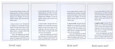
much as A heads do because of this. The B heads are
displayed in small caps, italic, bold serif, and bold san
serif in this instance.
fig 20 'B' head
C head: Emphasise particular sections of the B head
text. They don't halt the reading's progress. These C
heads are displayed in small caps, italics, serif bold,
and sans serif bold, just like B heads. For visual
separation, C heads in this layout are followed by at
least an em spacing (two space bar hits).
fig 21 'C' head
5. Cross Alignment
While expressing the complimentary vertical rhythms,
cross-aligning headers and captions with text type strengthens the
page's design sense (which makes the overall design
interesting).
maintain the cross aligned by increasing the leading by two. For
instance, if the headline heading is 13 x 2 = 26 pt and the small
text is 13 pt.
Lectures - Week 4
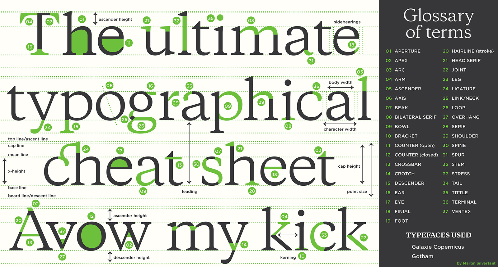
1. Describing Letterforms - Basic
1. Baseline: The letterforms' visual (imaginary)
foundation.
2. Median: A line that represents the average x-height of
letterforms.
3. X-height: The 'x' symbol's height.
4. A stroke is a line that outlines a letterform.
5. Vertex or Apex: Point formed by uniting two diagonal
stems.
6. Arm: Short strokes away from the letterform's stem.
7. Ascender: A lowercase letterform's stem portion that rises
above the median line.
8. Barb: Curved stroke with a half-serif ending.
9. Beak: Some of the horizontal arms have a half-serif
finish.
10. Bowl: A counter is represented by a rounded form.
11. Bracket, which separates the serif from the stem.
12. Cross Bar: A horizontal letterform stroke that connects
two stems.
13. Cross Stroke: A horizontal letterform stroke that
connects two stems.
14. Crotch: The area between two strokes.
15. Descender: A lowercase form's stem portion that extends
below the baseline.
16. Ear: A stroke that projects from the letterform's body
or primary stem.
17. Em: The size of the capital M.
18. En: Half size of em.
19. Finial: A stroke's rounded non-serif terminal.
20. Ligature: A character made of two or more letterforms
together.
21. Link: The line joining the lowercase G's bowl and
loop.
22. Loop: In some typefaces, a bowl is made in the
lowercase G's descender.
23. Serif: The foot at the end of the stroke is
right-angled or oblique.
Shoulder, a curved stroke that is not a bowl, is number
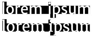
24.
25. Spine: The S's curved stem.
Spur: An extension that articulates where the curved and
rectilinear strokes meet.
27. Stem: The important straight or angled stroke.
Stress is the letterform's orientation, which is denoted
by the thin stroke in round shapes.
29. Swash: A flourish that lengthens a letterform's
stroke.
30. The tail is the curving diagonal stroke that appears
at the end of some letterforms.
31. Terminal: An independent, sans-serif end to a
stroke.
fig 22 Anatomy of Letterforms
2. The Font
1. Uppercase and Lowercase
2. Small Capitals (smaller uppercase)
3. Uppercase Numerals (are set to the same kerning width and have the same height as
uppercase letters) and Lowercase Numerals (are equipped with ascenders and descenders, and are adjusted to
the x-height. combined with capital and lowercase letters)
4. Italic (obliques are based on the Roman typeface with a slant
like italics) and Roman (uppercase forms are derived from the inscriptions of Roman
monuments)
5. Punctuation (standard in most fonts, but different characters
can differ from one typeface to another)
6. Ornaments
7. Boldface (characterized by thick stroke thicker than
roman) and Light
(lighter stroke than roman)
Lectures - Week 5
1. Understanding Letterform
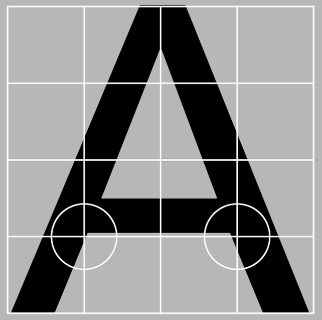
When viewed closely, some uppercase letterforms appear to be
symmetrical but are actually just a little different.
For instance, the point of the A in the Univers typeface
has a somewhat thinner stroke. This contributes to the
internal harmony and individual expression of the
letterform.
fig 23 The letter A from Univers font
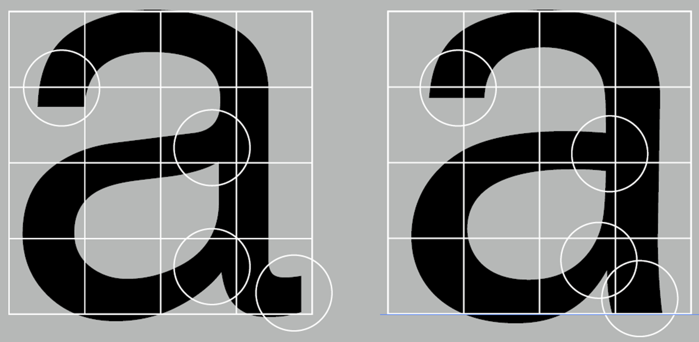
fig 24 the difference between 2 a letterforms
2. Maintaining X-height
In order for letterforms with curved strokes to seem the same
size as the vertical and horizontal strokes attached to it,
they must rise above the centre point or fall below the
baseline.
fig 25 Curved Strokes Extended Underlines
3. Form / Underform
For readability, counterform is necessary. To learn how
to make a letterform, we need to look at and understand existing
counterforms.
fig 26 Form and Counterform
4. Contrast
In order to differentiate information in text, contrast is
necessary.
fig 27 Contrast
Lectures - Week 6
1. Typography in Different Medium
Typography was first only applied for publications.It now
exists on screens as well as paper.
2. Print Type vs Screen Type
- Caslon, Garamond, and Baskerville (quite readable set
in tiny font size) for printing.
- For screen use, use type with a taller x-height,
broader letterforms, more open counters, heavier thin
strokes and serifs, reduced stroke contrast, and adjusted
curves and angles.
- Hyperlink (often blue and underlined): A word, phrase,
or image that points to a website.
- Screen font size: 16 pixels, or at least 12 points if
read at arms' length.
fig 28 Type for Screen
fig 29 Type for Print
3. Static vs Motion
Words can be expressed in static typography with few
characteristics. Billboards, posters, papers, and flyers
are just a few examples of the many places static
typography is applied.
Letterforms in motion typography are more fluid and
energetic and are dramatised type. Through animation, it
comes to life. Ads and MVs frequently use them. In order
to set the tone and atmosphere of related information,
it has developed to become expressive.
Instructions
Exercise 1 - Type Expression
We were given a list of terms to create type expressions for in Exercise 1.
We must select four words from the following list: Sick, Rain, Fire, Crush,
Water, Dissipate, Freedom. Are only allowed to use ten typefaces and are
prevented from using too many graphical elements.
Fire, sick, rain, and crush are the words I choose.
1. Sketches
fig 30 Type Expression Sketches (08/04/2023)
2. Digitalization
fig 31 Process (16/04/2023)
3. Final Type Expression
I finalized the design in response to his suggestion after receiving
feedback, and this is what I came up with.
fig 32 Finalized (20/04/2023)
fig 33 Finalized Pdf (20/04/2023)
Rain
In order to represent raindrops, I use the exclamation mark, a little
use of pen tool at the dots to simulate water droplets, and brackets
to emphasise the point at which the water falls. For rain i use "
Bembo Std Bold."
Sick
I use the bandage motif with brackets dots for the word "sick." I
slightly distorted the brackets and used lines on both sides. I use
the font “Futura Bold” for the word sick.
Crush
I used the concept of a glass shatter for the word crush and modified
the style to be hollow and full color because I was visualising two
sides of a glass. I apply lines for the glass breaking elements.
Moreover, I use the "Bodoni Std Poster Compressed" typeface for it.
Fire
Before it was finalised, I used the idea of a woodlighter, but now
I've adjusted it to look like a candle on the 'i' I use "Bodoni Std
Poster Compressed" as my font.
4. Animation
We should pick one word to be animated from the final four type
expressions. I decide on the word "fire." In order to begin our
animation using Illustrator and Photoshop, we must first view Mr.
Vinod's tutorial video in the lectures playlist.
fig 34 Timeline (24/04/2023)
fig 35 Final Animation (24/04/2023)
The idea is the same, only I added an element to animate it in the
form of a candle wax droplet.
Exercise 2 - Text Formatting
For Exercise 2, we must create a single final text
formatting style that includes font selection, type size,
kerning, leading, paragraph spacing, alignment, line
length, and other elements we've learned.
1. Kerning and Tracking
fig 36 Without Kerning (30/04/2023)
fig 37 With Kerning (30/04/2023)
2. Layouts
Important things to look at :
- font size 8-12
- line length (55-65/ 50-60 characters)
- leading +2 to 3 points larger than font size
- ragging (left alignment)/ rivers (left
justification)
- cross alignment
- paragraph spacing same as leading
fig 38 Layout 1 (30/04/2023)
fig 39 Layout 2 (30/04/2023)
fig 40 Layout 3 (30/04/2023)
3. Final Outcome
1. kerning & Tracking
fig 41 (30/04/2023)
2. Text Formatting
After adjusting it with changing the photos and etc I
choose layout number 2 the best out of the three
alternatives, therefore this will be my final
result.
fig 42 Final Outcome Text Formatting
(02/04/2023)
fig 43 Final Outcome Text Formatting PDF
(30/04/2023)
Margins and Columns: top (47px), bottom (170px), left
& right (30px), 4 columns
Font Size 10 ( Univers LT Std 45 Light - Body Text)
(Univers LT Std 63 Bold Extended - Title) (Univers LT Std 53 Extended Oblique -
Subtitle)
Leading +2 to 3 points larger than font size
paragraph spacing same as leading (12)
Feedback
Week 2
General Feedback: Do sketches before digitising to explore
concepts. Apply a fewer graphic elements, minimise
distortions and use the fonts provided in the Typefaces.
Specific Feedback: I made errors by using too many elements and a
font that was not part of the Typefaces, but some of my work is
still acceptable, such as the last sketch of "sick" and the
second sketch of the word "crush."
Week 3
General feedback: Take into account the word's placement in the
square as well as its overall composition. Use the right typeface to
express your message.
Specific Feedback:
- I needed to reconsider a new design for the word "fire" because I
relied a lot on graphic elements.
- Mr. Vinod suggested switching the serif font to a sans serif style
for the word sick.
- Mr. Vinod recommend moving the brackets for the word rain from below
the drops to alongside the droplet.
Week 4
General feedback: It is advised to pause at the last frame to give the
last frame a few seconds so that the GIF plays more smoothly.
Specific Feedback: Blog needs so much adjustments (Instructions before
exercises, the heading needs to be more specific, add lines)
Week 5
General feedback:
- Look out for line length (55-65)
- Use relevant images
- Avoid rivers
Reflection
Experience
Throughout the entire process for our assignment 1, exercise 1
& 2, the beginning was a little difficult for me because I had
no idea how to utilise Adobe Illustration at first. To be honest, I
was kinda stuck for the type expression exercise due to limited
excess for graphical elements and In text formatting, we must pay
close attention to details like kerning and tracking that affect the
entire text. Also, this exercise was given back-to-back. That was quite
stressful for me, perhaps because I'm still not used to it. I'll get
used to it, hopefully, and hopefully I can handle it better.
Observation
I've learned through the task at hand that kerning, tracking,
spacing, and leading all can have an impact on how text is set out.
Better graphics will be presented to readers or viewers with some
good above modifications.
Findings
Through exercise 1, i learned how to properly use various typefaces
and convey the impression of the words in text. Furthermore, the art
of organising letters so that their meaning builds up, they become
readable, and they have an appealing looks. We must pay close
attention to the slightest details in typography if we want to
improve in order to create eye catching text design.
Further Reading
Overall, this article explains the basics of typography,
shows several creative ways to apply its rules, and provides a
few examples. like kerning, leading, and tracking, for
instance. The most important lesson from the article may be
that the principles of typography are simply guidelines to be
aware of and indicate a right adjustment.
fig 45 A type primer
A guide on typography that discusses typeface classification,
typographic history, and the physical characteristics of type.
Additionally, the book offers guidance on choosing and
coordinating typefaces as well as how to employ typography
successfully in designs. The book's second edition now
contains additional illustrations of typography in design as
well as updated material on digital typography.
fig 46 Typographic Design Form and Communication
A comprehensive guide on typography covering the evolution of
the subject, the classification of typefaces, and the
structure of letters. In addition, the book offers guidance on
choosing typefaces, combining them, and making efficient use
of typography in designs. The book also provides information
on digital typography and the use of typography in
advertising, branding, and other contexts. Case studies of
typography in design are also included.
fig 47 Computer Typography Basics
gives information on basic principles of typography,
including font pairing, spacing, and choice of fonts.
Additionally, the book discusses issues including hierarchy,
readability, and legibility. The book also offers advice on
how to use type well in design, including how to align text,
employ contrast, and steer clear of typography mistakes.


.jpg)




.png)




Comments
Post a Comment