Information design - Flip Topics & Exercises
06/02/2024 - 14/02/2024/ Week 1 - Week 2
Amelia Intan Cahyani/ 0355211
Information Design/ Bachelor of Design (Hons) in Creative Media
Flip Topics & Exercises
Instructions
Instructions
Lectures
Flip 1 - Individual
In the first week's lecture, our lecturer mentioned that we'll
have weekly FLIP tasks, both individually and in groups. We'll
take turns presenting each week. For our individual task this
week, we were supposed to use a free online tool to redesign a
poorly designed infographic.
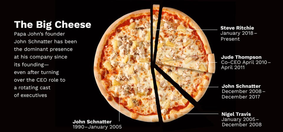
For my poor infographic design, I chose this design that I
found on a website because the infographic inaccurately
uses data visualization. While the topic is about pizzas, it
presents data about different company CEOs using a pie chart,
which doesn't fit the context.
 fig 1 Poor Infographic Design
After this, I chose to do a timeline infographic for my
redesign version to guide the information from time to time.
then I decided to design it with Canva from scratch.


fig 2 References
My final outcome is kind of similar to my references, except I
use a pizza theme for it. then I use a straight line, starting
from the past up to the present.
fig 3 Final Outcome
Rating & review of online tool using canva
Intuitiveness
Canva makes it easy for beginners to create various designs
like infographics, brochures, logos, and more. It offers
templates and straightforward tools for editing text and
elements, making the design process convenient and simple
even for those new to design.
Usefulness Canva offers a bunch of features for graphic
designers to use, while also being user-friendly for those
who are new to graphic design or unfamiliar with
professional design software. It simplifies the editing
process for text and images by providing a variety of
effects. Additionally, it provides a wide selection of
elements and images for various design needs. However, it
may be limiting for users who wish to create specific custom
elements, thereby restricting creativity and design
possibilities.
In the first week's lecture, our lecturer mentioned that we'll
have weekly FLIP tasks, both individually and in groups. We'll
take turns presenting each week. For our individual task this
week, we were supposed to use a free online tool to redesign a
poorly designed infographic.
For my poor infographic design, I chose this design that I
found on a website because the infographic inaccurately
uses data visualization. While the topic is about pizzas, it
presents data about different company CEOs using a pie chart,
which doesn't fit the context.
fig 1 Poor Infographic Design
After this, I chose to do a timeline infographic for my redesign version to guide the information from time to time. then I decided to design it with Canva from scratch.


fig 2 References
My final outcome is kind of similar to my references, except I use a pizza theme for it. then I use a straight line, starting from the past up to the present.
fig 3 Final Outcome
Rating & review of online tool using canva
Intuitiveness
Canva makes it easy for beginners to create various designs
like infographics, brochures, logos, and more. It offers
templates and straightforward tools for editing text and
elements, making the design process convenient and simple
even for those new to design.
Usefulness Canva offers a bunch of features for graphic
designers to use, while also being user-friendly for those
who are new to graphic design or unfamiliar with
professional design software. It simplifies the editing
process for text and images by providing a variety of
effects. Additionally, it provides a wide selection of
elements and images for various design needs. However, it
may be limiting for users who wish to create specific custom
elements, thereby restricting creativity and design
possibilities.
Flip 1 - Group
Exercise 1 - Quantify and Visualize Data
we were given the task of organizing the items and
displaying them in graphs, charts or other visuals with
certain and relevant indicators written in order to
provide a set of data
I decided to use Indonesian coins for this exercise
and arranged them in a pyramid structure, from highest to
lowest value (bottom to top).
fig 4 Coins
fig 5 Final Outcome
Exercise 2 - L.A.T.C.H
This week, our task is to design a new infographic poster based on the L.A.T.C.H. principles, which include:- Location- Alphabet- Time- Category- Hierarchy
I decided to do pokemon design.
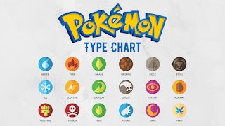
Collecting data and Visual references:
 fig 6
fig 6
Sketches and Progress:
I decided to put the location inside the character frame
fig 7
Final Outcome:
This week, our task is to design a new infographic poster based on the L.A.T.C.H. principles, which include:
- Location
- Alphabet
- Time
- Category
- Hierarchy
I decided to do pokemon design.
Collecting data and Visual references:

fig 6
Sketches and Progress:
I decided to put the location inside the character frame
fig 7
Final Outcome:


Comments
Post a Comment